
Major redesign at Liberty
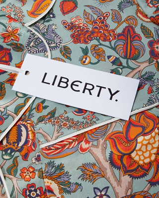
2020 is a big year for Liberty: marking 145 years in business, the retailer is refurbishing its unique Tudor Revival flagship, re-branding and relaunching its e-commerce site.
A major restoration of Liberty's Mock Tudor building, a protected landmark, which started earlier this year continues. The store, built in 1924 from the timbers of two ancient battleships, has 1,550 windows that need to be removed and refurbished, many of them set with reclaimed stained glass from the 12th century. For the first time since the store was built, the unique casement windows will be repaired by specialist craftsmen, off-site. Liberty said heritage restoration experts will aim to imitate the work of medieval blacksmiths, echoing the founder's support for hand craftsmanship.
As for the new, more streamlined logo, it was inspired by the Liberty sign that's been swinging above the store. It's the design studio Pentagram that redrew the Liberty logo using the sign's original typeface. Pentagram's work also led to the development of a bespoke, "Lasenby" sans-serif font, which will be used across the brand's communications.
With regard to the new web site, Eric Fergusson, Liberty's e-commerce director, said the updated LibertyLondon.com is "faster than ever," and also features enhanced presentation of content. The web site has seen strong revenue growth, averaging 45% per year for the last three years, while international growth has been driven by "functional improvements and brand awareness" of Liberty. The retailer said customers can shop from almost any country in the world with 200 shipping destinations, and more than 90 local currencies.
wwd article: Liberty Sails Ahead With Re-branding, Refurbishment Despite COVID-19 Challenges
Related posts

M&S and Sephora enter partnership to bring new beauty destination to the high street
M&S and Sephora enter partnership to bring new beauty destination to the high street
Heading 1
Heading 2
Heading 3
Heading 4
Heading 5
Heading 6
Lorem ipsum dolor sit amet, consectetur adipiscing elit, sed do eiusmod tempor incididunt ut labore et dolore magna aliqua. Ut enim ad minim veniam, quis nostrud exercitation ullamco laboris nisi ut aliquip ex ea commodo consequat. Duis aute irure dolor in reprehenderit in voluptate velit esse cillum dolore eu fugiat nulla pariatur.
Block quote
Ordered list
- Item 1
- Item 2
- Item 3
Unordered list
- Item A
- Item B
- Item C
Bold text
Emphasis
Superscript
Subscript

Selfridges profits soar as it calls for tax-free shopping return
Selfridges profits soar as it calls for tax-free shopping return
Heading 1
Heading 2
Heading 3
Heading 4
Heading 5
Heading 6
Lorem ipsum dolor sit amet, consectetur adipiscing elit, sed do eiusmod tempor incididunt ut labore et dolore magna aliqua. Ut enim ad minim veniam, quis nostrud exercitation ullamco laboris nisi ut aliquip ex ea commodo consequat. Duis aute irure dolor in reprehenderit in voluptate velit esse cillum dolore eu fugiat nulla pariatur.
Block quote
Ordered list
- Item 1
- Item 2
- Item 3
Unordered list
- Item A
- Item B
- Item C
Bold text
Emphasis
Superscript
Subscript